Sharing Cathy Johnson’s tutorial for the folded paper journals I use for color studies. She starts the “how to” part at minute 3:44.
Category: “How To” & Tips
Testing: Hematite Burnt Scarlet

Does anyone else go to the art supply store, buy a tube (or three) of paint, bring it home and start right in on a painting? How many times have you been a little (or a lot) disappointed in the results? The answer for me was, often enough to stop using new colors until I’d tested them!
When I bring home any new pigment, I like to introduce it to the rest of the palette. I’m looking to see how well it blends with other colors, how the properties of pigments combine or clash, how well it holds its color & value, and how much it changes from the initial wet wash to when it’s completely dry.

Meet Hematite Burnt Scarlet (HBS), one of the PrimaTek colors from Daniel Smith. Made from ground up rocks, these colors almost always provide interesting texture and color. As you can see with the blues and greens pictured, it brings out some unique properties of other pigments. It’s always fascinating to me to see which colors maintain their strength and clarity, such as Spring Green or Cobalt Blue, and which ones almost completely blend together, like Lunar Blue or Cobalt Turquoise. (All colors shown are Daniel Smith watercolors.)

With the reds and browns, it was harder to get HBS to interact. You can see that Transparent Red Oxide (TRO) and Permanent Alizarin Crimson were particularly “standoffish” and created harder edges where the two colors met. This isn’t a bad thing, but when texture is your goal, it’s good to know that those two colors will create a very different passage than Burnt Sienna or Pyrrol Red.

To create these swatches, I wet a rectangle of paper with clear water, then paint my primary color in the upper left corner. The secondary color is painted into the lower right corner. Then, I pick up the paper and encourage the two pigments to mingle. (I change water frequently to make sure there are no tints coming over from other colors.) In the first photo of yellows, the Hansa blend is nearly dry; Mars is still slightly shiny, and Raw Sienna has just been added.

Now that all three yellows are dry, you can see how the pigments settle into the paper as the water evaporates. Look at how different the texture is with the Hansa mix – there is almost an orange peel effect, while Mars Yellow has a milky effect. With Raw Sienna, the subtle pink tones of Hematite Burnt Scarlet create a soft orange with hints of purple.
 Knowing this color a little better now, I’m excited to try it out on a new series of “rusty things” paintings I’m planning. Look at how it blends with Green Apatite Genuine – doesn’t that look like pitted metal?! The way HBS reacts with French Ultramarine looks like peeling paint, and the Cobalt Blue mix is pure rust. Not sure what to think of the Perylene Green blend…that one has me thinking of forest shadows…
Details: Finding the painting in the photo

When you hear the word “detail,” do you think of fine lines, wisps of hair and other finishing touches on a painting? While those can be important to a painting, details include anything that supports the story you want to tell: shapes, colors, lighting, mood, value, contrast and more. The joy of being an artist is that we don’t have to tell the literal story of our photo; we get to tell the story it represents to us. What happens when you decide to work from a photo that is filled with all of building blocks of a successful painting, and also a lot visual clutter that adds nothing to your vision?

This quick cellphone snap was taken in a gas station parking lot. Looking across the valley, late afternoon sunlight touched trees tinged with early fall color and washed across the farm fields. The beauty of the moment is almost lost in all of the distracting shapes, lines and abundance of outbuildings. The first step in finding the painting in the photo is to identify everything that doesn’t support the play of light across the scene.

Taking the image into Photoshop, I circled all of the visual clutter. This included the foreground plantings and road, fenceposts, vehicles and power lines. While the farm animals and windmill may be included in the final painting, they are not important to the story of the sunlight, so are marked as distractions.
The elements that stand out as desirable are the bands of light and shadow across the fields; the layered colors and shapes of trees receding into the background, and the simple shapes of the barns to add scale.

Once the clutter was removed, the shapes and relationships of the buildings at left seemed a bit small and tight. Notice how the silver barn in front has been turned red and shifted to the left, helping to widen the feel of the scene. The very near foreground has been completely simplified, and the shape of the dark tree at far left has been extended down to anchor the left side. With the sky cleared of power lines and the hill darkened a bit, the deciduous trees and fields can now take center stage.
With a bit of evaluation and some strategic planning, a quick snapshot becomes a reference photo that highlights the best part of the scene. Photoshop made it easy, but this can also be done with our sketchbook, or with a printout and a pen. This is one of the exercises we’ll do in my “Seeing the Details: What Stays and What Goes” class on Saturday, November 17th at Cloud 9 Art School. Visit the Classes page for more details and to register.
Nita Engle’s 6-way wash technique

One of my favorite art instruction books is “How to Make a Watercolor Paint Itself” by Nita Engle. Nita includes a variety of experimental techniques for creating dramatic waves, clouds, and atmospheric backgrounds. One that I use quite often is her 6-way wash. It works well for establishing skin tones, and can also force me away from trying to match the colors in a reference photo.
To create the wash, the entire area is wet with clean water. A central area of light color is painted, then ringed with a second color. A third color is painted around the outside. The entire surface gets a spritz of water, and then you pick up the paper or board and tilt it back and forth, encouraging the colors to merge and mingle.

Taking this approach further and thinking about backgrounds for landscapes, I experimented with a few different washes. The first combo was selected to indicate sunlight through the forest. Rather than using all greens, I tried adding a pink tone to the mix for warmth. This is Phthalo Yellow Green, Rhodonite Genuine (the pink) and Perylene Green.

This technique would also work for the inside of a large, scalloped shell, using Mars Yellow, Rhodonite Genuine and Manganese Blue Hue. The lifted area shows how the paint could be removed to create the raised folds of the shell.

Find Nita’s book on Amazon: How to Make a Watercolor Paint Itself
Why the “why” of a painting matters

One of the topics that I often discuss in classes or demos is: Why?
Specifically, why do you want to tell *this* story? What is it about this photo or subject that says “paint me?” Is it the light, or the colors, or something more subtle: a mood, a memory, an appealing shape? Perhaps you just want to capture the cheerful flowers in a market stall, or the patina of a weathered wall.
Spending a few minutes determining the “why” of a subject will be tremendously helpful in creating a successful painting. As you can see from my example, the first time I tackled this subject I said “Oh, I love this photo, I’m going to paint it.” And that’s basically what I did – painted the photo. It’s a nice painting, but not terribly engaging, and I knew there was more in the image than what I’d captured.
The second time around, I spent some time asking myself what I really wanted to convey. What I loved about the scene was the relationship between the girl and the goat. Secondary to that was the girl’s posture and the simple beauty of her white clothing. By changing the orientation of the painting and dropping out most of the surroundings, “Love-A-Fair” becomes an image that tells a story, and gets people talking about their own 4H memories.

10 things to do in the studio when “art” isn’t happening

Having an Anti-Art day? On Anti-Art days, the brushes don’t feel right in the hand; pencil leads break, papers tear, the pigments don’t mix the way we expect, and every layer of paint feels like a muddled mess. Great. You managed to schedule two hours of studio time, and the remaining hour and 45 minutes stretches ahead of you like an eternity. No worries! There are lots of ways to fill time in the studio:
- Inspect your art tools. Whether you paint, sculpt, draw or collage, you probably have a lot of tools laying around. Gather your brushes, and give them a once-over. Clean what you can, purge what you don’t use, and make notes on which need replacement. Pull your pens and pencils
 out for a tune-up: sharpen leads, check that pens are working, sort by type and color, and stow duplicates. Clean storage cases of broken leads, eraser “scraps,” bits of paper and other debris.
 - Refresh your palette and paints. Pry out cracked, dried cakes of watercolors, and leave the newly-cleaned well empty for a while. Either wipe out dirty favorites or empty the well, filling with fresh pigment. Check tubes of paint to make sure lids are secure, and toss tubes that are empty or have dried out. Order up replacement paints, or snap a photo with your phone so you know what to pick up at the art supply store.
- Watch an art tutorial. From YouTube to artists’ websites to Facebook Live and DVDs, there are great resources for learning from other artists. This can be a great time to check out an artist or technique in a genre you’re unfamiliar with. Don’t expect to work along with the artist, just kick back with a notepad or tablet and take it in.
- Update your website. Does your site display your freshest work? Is your bio up-to-date? What about your gallery or online store – are sold works marked, or removed? Is your “latest accomplishment” more than six months old?
- Organize reference photos. This is a tough one! Those of us that work from reference photos have hundreds, if not thousands of digital files. Start small by creating folders for each type: landscape, sky, portrait, dogs, buildings, cars, etc. Then, just dump everything you come
 across into the appropriate folder. Later, you can go back and evaluate the images in each folder and decide which are the best/most useful.
 - Create an inspiration wall. Do you have a box or basket full of pages pulled from magazines, scraps of fabric or wrapping paper, greeting cards, internet memes or paint swatches? Get them out where you can see them and be inspired!
- Revisit a favorite art book. It seems like art books reproduce on the shelf, quickly growing from three to ten to a full bookcase. Grab a book or two and flip through them. Make notes or mark useful information. If nothing strikes you as noteworthy, consider donating the
 book to your art association or local school.
 - Start or update your inventory. Whether you give your paintings to friends, take on frequent commissions, have an Etsy shop or sell in galleries, it’s a great idea to have an inventory of finished paintings. There are online resources available, or you can start a spreadsheet in Excel.
- Grab a coloring book. I know, it’s trendy right now, but coloring books
 are a great way to practice shading, color blending and setting a light source. Often, when we color our own sketches, we start to take things too seriously, and become afraid of “ruining” it. Coloring books are inexpensive, and are meant to be temporary, so it’s easier to “let go” and just play.
 - Clean the studio. Clear off the table and give it a good scrubbing; wash the window(s), empty the trash, replace light bulbs, re-shelve books, file papers…after 15 minutes of this, you just may be ready to create art again!
Creating a road map

Painting a busy, colorful street scene can seem overwhelming, but some time spent on planning can take some of the intimidation away. In this photo of Post Alley in Seattle, bright colors and café tables create a welcoming yet visually challenging scene. There are a number of ways to simplify it.

If you’re comfortable with Photoshop or have a drawing program on your tablet, you can remove elements digitally. Here, I got rid of the clutter in the lower right; unified the seperate planters into one mass, and darkened the upper right corner to take attention away from the background buildings. A few other unimportant details have been eliminated.

Next, I printed out a black & white copy. The lack of color really highlights the pattern of lights and darks. As you can see, there is no real focus to the image, so I want to create a trail of light that will lead the eye through the painting and return us to the seating area. A few minutes with a pencil gives me a (mostly) two-value study and a clear indication of where the lightest areas and brightest colors will be:

With this at my side as I paint, I’ll have a reminder of what areas to de-emphasize with darker values or more muted colors. Next, I’ll do some quick studies to determine the color palette…

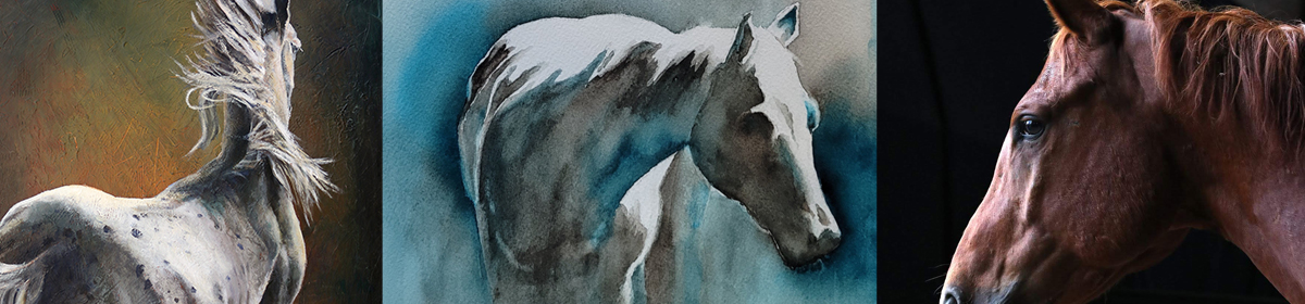
Experimenting with an Appaloosa’s spots

The subject of this painting is a “leopard” Appaloosa with an amazing array of spots over its entire body. Painting the form of the horse was pretty easy, but those spots are something else! While the urge was strong to just dive in and start painting blotches, I didn’t want to mess up a good start. So, I pulled out the patience and a piece of scrap paper and began to experiment with different options. And wow, am I glad I did!
My initial thought was to use a dark, sedimentary color like Hematite or Sepia. Nope, both turned too brown. Surprisingly, Van Dyck Brown (VDB) mixed with French Ultramarine into a deep, rich dark that didn’t leave a brown edge. Payne’s Blue Gray (PBG) came into the mix, along with Cobalt Blue. Verditer Blue and Lunar Blue were tried and rejected, but Burnt Sienna made the cut.
Along with color, technique was a big part of the puzzle. Different attempts at wet-into-wet, wet-into-dry, spattering, and blurring edges all got a tryout.
In the end, I’ll use Cobalt and Burnt Sienna as a gray base, with VDB dropped in and French Ultramarine lightly splattered, then lifted for a random splotch. When nearly dry, VDB, PBG, French Ultramarine and a touch of Green Apatite Genuine will form the dark central spot. (The green will echo colors in the background.) Some of the edges will get pulled or blurred to add variety.
This was a great lesson in experimenting with materials before going straight to the painting. I definitely would have been unhappy with the results of the first 10 options, and probably would have given up on the painting in frustration!
Replacing a paint color

In a limited palette of just twenty colors, each one needs to be a “go to” hue. While adding fresh paint recently, I realized that Chromium Green was virtually untouched. It’s a strong, neutral green, but has a milky look to it that doesn’t really fit the way I paint. So, out it goes. But what to put in its place?
Rooting through my tackle box yielded 6 candidates: Rare Green Earth, Undersea, Olive, Pthalo Yellow/Green, Cobalt Turquoise and Pthalo Turquoise.

After doing quick paint swatches and lifting tests, I painted a series of blended strips. Each green stayed in the same location as on the test chart for easy reference. I wet a small rectangle, dropped in the green, then added one of six colors that are used frequently:


As you can see, Pthalo Turquoise dropped out pretty quickly. Almost identical to Cobalt Turquoise, it lacked the granulation Cobalt gave. Rare Green Earth was next to go. It’s very grey, which was interesting, but it likes to sit where you put it and needs lots of coaxing to move. Undersea would probably have a home in a larger palette.

The finalists came down to three: Olive, Pthalo Y/G and Cobalt Turquoise. Olive will go into the “working stash” and be used for horsey browns. Cobalt Turquoise will replace Chromium Green, and Pthalo Y/G will replace either New Gamboge or Quinacridone Gold. (Another round of testing ahead!)
I’m a firm believer that the better you know your colors, the more likely you are to get predictable results in watercolor. This entire testing process took about 90 minutes, and was a great way to get to know these six greens.
A surprising study

A lot of my time in the studio comes in one or two hour blocks, usually during the evening on “school nights” (I work full time). I’m not sure how other artists work, but when I get going on a painting, I like to have the option of staying with it for three to four hours.
So what to do with those blocks of time in the evenings? There’s no shortage of ideas! Working in the art journal, learning with online tutorials, planning paintings, plus color studies in oil, acrylic or watercolor.

A great way to learn the characteristics of watercolors is to create “two and one” triads, where the two sides remain the same color, and the center changes each time. The color is dropped onto wet paper, and more water is added to get the paints to really move. This is a great way to learn how different colors behave when wet, and also how they change as they blend and dry.

As I was working a triad of transparent red oxide, cobalt blue (side colors) and mars yellow, I was surprised at how the yellow behaved. Unlike most yellows that turn green on contact with blue, mars yellow held its own, shading more towards grey.

As I tipped the paper side-to-side to blend the colors more, it was fascinating to see how the colors reacted to each other.

In the final, dry study (top of post), there are lovely mixes of earthy browns and greys, with undertones of the blue and yellow – and even a hint of violet. Knowing how these colors mix, and having a page full of reminders, is invaluable when I have the time to spend on a “real” painting!